Sabra; An e-tail landing page
I decided to create this mini-project because I felt like doing something out of my comfort zone. Usually, my aesthetic tilts towards matted colors and softened corners. This time, I made something completely different. Sabra isn't a real webshop, however, I aimed to make the aesthetic match the prospective audience.
Sabra is a cactus fruit that grows in the desert. It's often used metaphorically to describe someone who is prickly on the outside yet sweet in the inside; attributions that echo the qualities of their namesake.

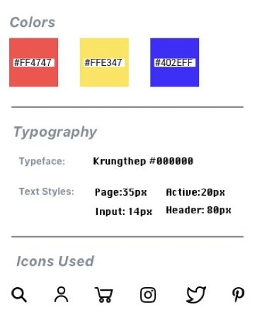
To portray this, I used sharp corners, bold colors and a geometric font. I only used black and white in the function sections to create a stark contrast with the bold colors in the content, therefore increasing the visual feeling of edgy.The final product is below. Below is a brief style guide I made to consolidate the aesthetic themes so I could to organize my visual goals:
Video Demonstration
Below is a short video demonstration of what the site would look like in a browser. I made the choice to have the images fill the page to dazzle the viewers eye with the products advertised. I was inspired by Zara's online webshop when I made this choice

Lastly, below is the full page.
