Politie
For the third group project in my master's program, were assigned the difficult task of building a tool for the Dutch Politie’s (Police) innovation department. They wanted us to create a platform that would enable them to visualize all goals while involving other staff. Secondly, they needed a way to change to convince other staff why innovation was necessary.
Part 1: Research and Empathy
Stakeholder Mapping
In order to understand the affected parties, we set out to categories the stakeholders by creating a stakeholder map.

We then asked our clients to map out their own stakeholder maps to get a better understanding of how they view the problem space and who should interact most with our artifact. We had them write down all impacted parties that they could think of and place them in the order from most to least affected. We then presented them with pre-made Post Its that matched our own impressions and asked them to map them once again. We did so to compare our impressions with theirs.
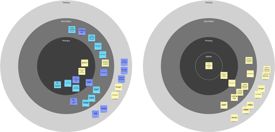
We created a new map based on our impressions from the co-creation session so we could continue with our design. When we needed to shift directions, we had to re-evaluate our stakeholder maps. We added an inner ‘Admin’ later when it was evident that our primary stakeholders would be expanded to include operational police staff

During the empathizing phase, we did a ‘how-might-we’ session to brainstorm with our clients on ways to solve their problems. We did this to help us get a better understanding of their problem space.
Part 2: Ideating and Prototyping
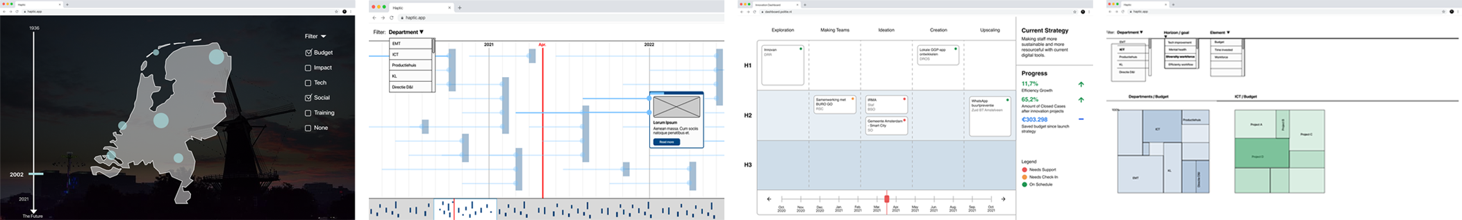
After reviewing our notes from the stakehodler exercises and how might we sessions, we each sketched possible prototypes that could lead to a solution. Our sketches had many commonalities including a timeline, project pages with detailed information, and ‘submit your own idea’ tools.

Our client communicated to us that they were concerned our idea was too much like a platform they were already developing, so we had to begin brainstorming again. This is where we came up with the idea of informing the greater organization by means of storytelling. We did another sprint sketch, this time digitally to externalize how each of us viewed how this could be done, and then presented them to our client. The objective of this exercise was to find out the features they like and should be developed further, and which to disregard. They liked the overview features enabled by the treemaps and progress bars and liked when projects could be compared to each other. They also noted that they liked the context that the timelines and map provided.
Part 3: Testing and Refining
We interpreted their positive feedback about overview and comparison tools to be the best way to proceed, so we created a platform that allowed users to compare elements like a budget with different projects with those in other departments. We executed this in a treemap.

We also created a timeline view based on their positivity to providing context.
We then tested our prototype with a variety of stakeholders, including a dispatcher, a detective, and a core member of the innovation team. The test results were interesting: the innovation team preferred the treemap overview whereas the ‘operational’ employees liked the timeline view more. We faced an important decision of which to develop further. We decided to combine the two by featuring the timeline view as the main platform while providing more detailed overviews within the project and theme pages.
We proceeded to develop our mid-fidelity prototype based on our findings and new direction.
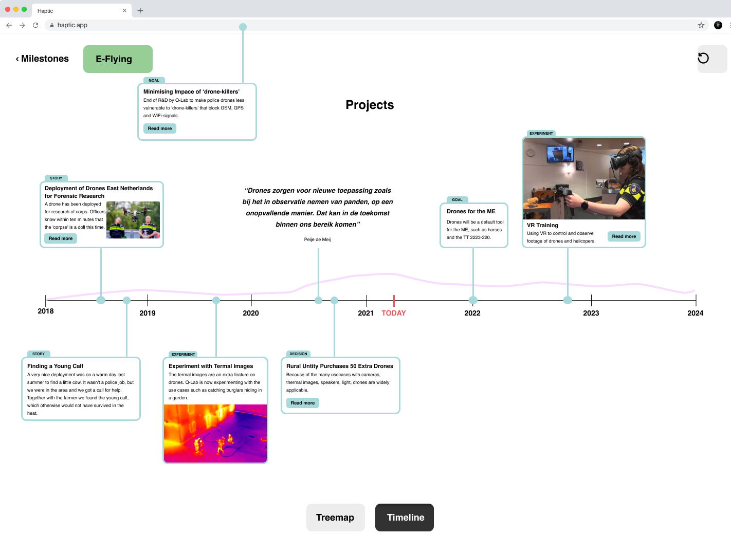
As we wanted to make the user excited about innovation, we needed a way to hook in the user, so I designed a landing page that had statistics about the success of innovation, as well as subtle, yet attention-grabbing animation. The user is welcomed with a series of statistics that demonstrate the accomplishments and benefits of the innovation efforts.
By scrolling through this interactive timeline, the user can learn about the all projects that the innovation team has worked on in the past, is currently working on, and what is planned for the future. Each project card includes an overview of its phase. Furthermore, as projects are part of greater efforts, called ‘themes’, each theme is represented in a card, so the user can understand how each project is used to achieve a theme’s goal.
If the user hovers over a project card, they can read a brief overview of each project to understand its basic mission.

When the user clicks a project or ‘theme’ card, a overlay screen opens with more detailed information including budget breakdowns, people involved, and target dates.

We also created a series of mobile screen prototypes. We did this because the Politie is slowly transforming a lot of their work onto mobile platforms, and we wanted to keep our platform relevant in this transformation.

We created a civilian view so that non-staff could see what was happening within the police force. We did so to promote transparency. However, for the sake of security concerns and sensitive data, we reduced some of the visible information like some projects. We eliminated the contact information for the involved staff to protect their privacy and changed the contact information into a press office contact point.

Lastly, we made a view for the innovation team that included features that enabled them to edit the content.
